There are a variety of headline styles that offer flexibility and bring interest to a design. Having several headline styles and spacing options to choose from gives communication pieces more flexibility and ensures the design doesn’t feel repetitive from page to page. The format, available space and layout pacing will often determine what treatments work best within the design.
-
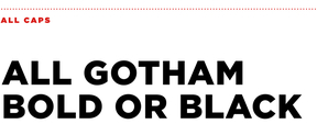
Gotham Bold or Black
At its simplest, a headline can be set in Gotham Bold or Black and offer enough branded personality. It’s best to set headlines in ALL CAPS and keep tracking set to 0pt, optical for a strong presentation.

-
Bodoni Poster Italic
As a secondary type style for supporting headlines in longer documents, Bodoni Poster Italic may be used on its own. Bodoni Poster Italic should always be set in all lowercase, with tracking set to 0pt.

-
Mixed Type
Our preferred headline style is a graphic and expressive variation that combines both brand typefaces for maximum impact. Use Gotham Bold or Black, set in all caps, to highlight your headline’s action words or most important ideas. Then use Bodoni Poster Italic, set in all lowercase, for all other wording to complete your headline. The resulting contrast is at the core of the UVA Wise branding system, and efforts should be made to incorporate this type style in all major branded communications.

-
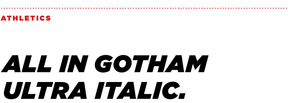
Gotham Ultra Italic
For materials in the UVA Wise Athletics brand, Gotham Ultra Italic may be used on its own, set in all caps, to signify action and speed. Tracking should be set to 30pt for optimal readability.

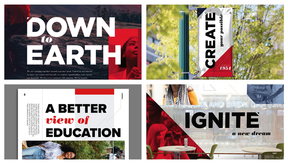
Headline Application
Here are some examples that illustrate the various headline styles and how they are used in layout.

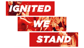
Athletics
This ready-made, textured treatment is commonly used for Athletics headlines and is included in the toolkit. For all other Athletics headlines, use standard Gotham Ultra Italic.

Best Practices
Setting type is a subtle art. It is important to have guidelines in place to ensure legibility and continuity of the brand. Here are some general rules to keep in mind when laying out type for headlines or body copy.
Headlines are always set larger than the body copy and in the bold weight, which provides the most contrast from body copy.
Body copy should be set between 7-11pts for print, and 12-16px for web.
Things to Avoid When Setting Headlines
- Do not create your own modifications to the font. Use only the typefaces provided.
- Do not use the outline headline style in a size smaller than 30pts.
- Do not place the headline over a photo in such a way that the legibility is compromised.
- Do not vary the size of a specific weight or style within a headline treatment.
Things to Avoid When Setting Body Copy
- Do not track out the body copy more than 5pts as it becomes difficult to read.
- Do not set body copy in all bold; it will become too dense to read at small sizes.
- Do not place the copy over a photo in such a way that the legibility is compromised.
- Do not set body copy in a weight other than light, regular or medium for call-outs.