Athletic Toolkit
- Home
- Brand Essentials
- Tools & Templates
The primary logo for UVA Wise Athletics is the Power V. Freshly updated in 2019, it is designed to capture our strength, energy, forward motion and the pride of our athletics programs.
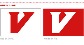
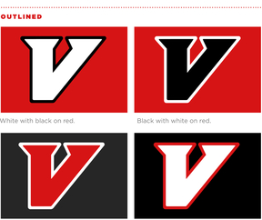
As our Athletics logo, this mark is intended for any and all items that need to represent UVA Wise Athletics, and only Athletics. The Power V is also available in outlined variations for use when needed. See the following page for more guidelines for color variations.
Athletics Colors
In order to maintain a strong link with the heritage of the athletics brand, we are using Highland Red and Highland Black as the primary palette for Athletics only. This will aid in the transition to a refreshed brand.
The lead color for UVA Wise institutional branding is an updated red called Highland Red. Supporting this is UVA’s Jefferson Blue.

Highland Red
PANTONE 186
CMYK Coated: C-2 M-100 Y-85 K-6
CMYK Uncoated: C-1 M-91 Y-72 K-3
RGB: R-210 G-20 B-20
HEX: #D21414

Highland Black
CMYK: C-30 M-20 Y-10 K-100
RGB: R-0 G-0 B-0
HEX: #000000
Color Variations
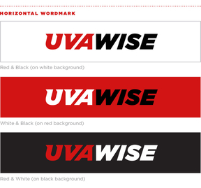
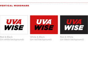
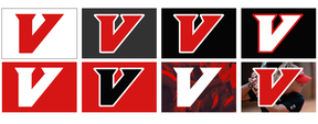
There are many color variations of the Power V needed for use on signage, uniforms, print and digital materials and internal communications. Here are the usage guidelines and approved versions for use on white, red, black, gray and photo backgrounds.
Downloads
Logos by Sport
- Baseball
- Basketball
- Cross Country
- Cross Country and Track & Field
- Football
- Golf
- Lacrosse
- Tennis
- Track & Field
- Softball
- Volleyball
Incorrect Usage
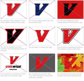
Correct and consistent use of the Athletics logo is an essential part of building brand equity. While flexibility has been built into the visual identity system, the use of each element has been carefully defined.
- Do not add a drop shadow or any other effects to the primary logo.
- Do not use unapproved colors for the primary logo.
- Do not use unapproved color configurations of the primary logo.
- Do not place the primary logo in a container shape of any type.
- Do not skew or stretch the logo.
- Do not add an additional outline to the outlined version of the logo.
- Do not add the wordmark or other elements to the primary logo.
- Do not place the primary logo on a color that does not provide sufficient contrast.
- Do not place the primary logo on visually distracting backgrounds.
In 2019, UVA Wise released new brand assets that update and/or replace the following:
