About the System
Our logo is the most important and recognizable element of our brand’s identity. It is an icon that represents our organization to the outside world and acts as an identifying and unifying mark.
There are three variations of the logo that serve specific purposes. The primary logo is the preferred mark. The longform version is available for formal applications. The stacked logo can be used when a vertical orientation is required.
Using the logo consistently ensures that we build and protect the equity and recognition of our brand. All usage of logos must adhere to these guidelines, which include both internal and external projects. Further details on the appropriate use of institutional logos are provided in the sections that follow.
Do not alter, redraw or add any additional words or graphic elements to the logo.
Color Variations
Our logos are available in multiple color variations. Here is an explanation of when and where to use each one.
Full-Color Logo
The Pantone, CMYK or RGB full-color logo is always preferred. Use Pantone or CMYK for any print applications such as collateral or business materials. Use RGB for digital applications such as for web, presentations or video.
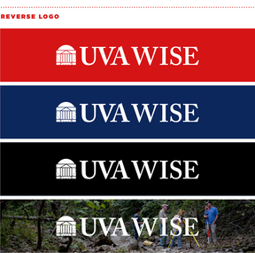
Reverse Logo
Use the reverse logos for applications on color or photographic backgrounds. Always ensure that the background you choose provides sufficient contrast for the logo.
One-Color Logo
When full-color printing is not an option, use the black version of the logo. This is also helpful for applications such as embossing, debossing, die-cutting or extrusion. One color red and one color navy logos may be used on merchandise.
Downloads
Primary Logo

Longform Logo

Stacked Logo
Incorrect Use
Correct and consistent use of our logo is an essential part of building brand equity. While flexibility has been built into the visual identity system, the use of each element has been carefully defined. Here are a few examples of things that should not be done.
All examples shown here use the primary version of our logo, but all rules also apply to the entire system of logo variations.
Incorrect Use: Primary Logo

- Do not add a drop shadow or any other effects to the logo.
- Do not use unapproved color combinations for the logo.
- Do not crop or remove any parts of the logo.
- Do not place the primary logo in a container shape of any type.
- Do not crop or remove any parts of the logo.
- Do not rearrange the elements of the logo.
- Do not add additional information or elements to the logo.
- Do not place the logo on a color that does not provide sufficient contrast.
- Do not place the logo on visually distracting backgrounds.